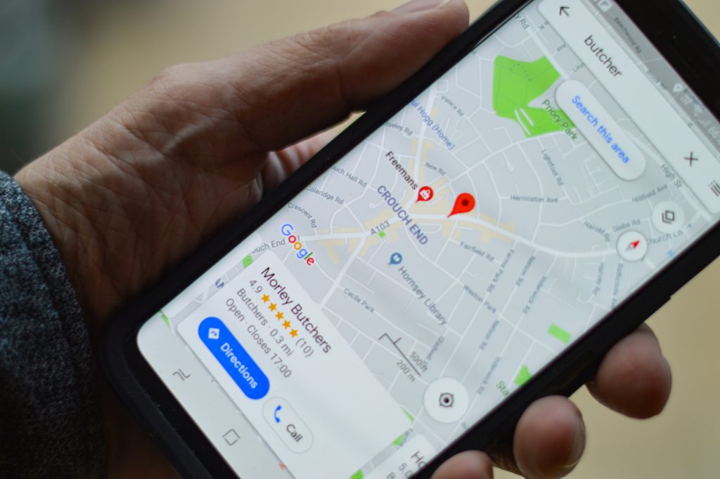
Think back to the last time you searched for something online. Chances are, you did it on your phone — not a desktop. Whether it was finding a restaurant, browsing a store, or researching a business, mobile is now the first touchpoint for most users. That’s exactly why mobile first design is no longer just a nice-to-have. In 2025, it’s the standard, and businesses that ignore it are already falling behind.
If you’ve been wondering why there’s so much buzz around mobile first design and what it means for your business, let’s break it down.

What Exactly Is Mobile First Design?
At its core, mobile first design is a web design approach where websites are created for mobile devices first, then adapted for larger screens like tablets and desktops. Instead of designing for a big desktop monitor and trying to shrink things down, the mobile experience becomes the foundation.
Why? Because for most of your audience, mobile is where they’re meeting your brand for the first time. If your site doesn’t load quickly, look good, or function smoothly on a smartphone, you’re instantly at a disadvantage.
Mobile Isn’t Just Growing — It’s Dominating
Here are a few stats that make the case clear:
- Over 70% of global web traffic comes from mobile devices.
- Google now uses mobile-first indexing, which means it looks at your site’s mobile version to determine how you rank in search results.
- Nearly 60% of online purchases happen on smartphones.
The takeaway? If your website isn’t designed with mobile users in mind, you’re not just behind the curve — you’re actively losing potential customers.
Why Mobile First Design Matters More Than Ever in 2025
1. User Experience Comes First
We live in a world where attention spans are shorter than ever. If a visitor lands on your site and can’t figure out how to navigate or finds themselves pinching and zooming just to read your text, they’ll leave — probably within seconds.
Mobile first design forces you to focus on what’s most important: clear navigation, fast load times, and content that’s easy to digest.
2. It’s an SEO Power Move
Google prioritizes mobile-friendly websites. A clunky mobile experience doesn’t just hurt your users — it hurts your visibility in search results. With mobile first design, your site is built to perform in Google’s mobile-first index, helping you rank higher and stay competitive.
3. Conversions Happen on Mobile
Think of how many times you’ve ordered food, shopped online, or booked an appointment straight from your phone. That’s the reality of today’s consumer behavior. Optimizing forms, checkout processes, and calls-to-action for mobile is critical if you want your site to convert visitors into paying customers.
4. It Future-Proofs Your Business
Technology isn’t slowing down. As mobile devices evolve and screen sizes change, mobile first design ensures your website can adapt seamlessly. Instead of constantly patching and reworking your site, you’re starting from a solid foundation that’s built to scale.
What Happens When You Don’t Go Mobile First
Ignoring mobile first design in 2025 isn’t just a missed opportunity — it’s a direct hit to your bottom line. Here’s what can happen:
- High bounce rates because users leave your site out of frustration.
- Lower search rankings thanks to poor mobile performance.
- Lost conversions when checkout forms or buttons don’t work well on phones.
- A weaker brand reputation because an outdated website signals you’re not keeping up.
Simply put: a non-mobile-optimized site can cost you both customers and credibility.
Best Practices for Mobile First Design
So, what does a great mobile-first website actually look like? Here are some must-follow principles:
- Simplicity is key: Mobile screens are small, so prioritize essential content and trim the fluff.
- Speed matters: Optimize images, minimize code, and leverage caching. If your site takes more than 3 seconds to load on mobile, users will bail.
- Thumb-friendly design: Buttons and CTAs should be big enough to tap easily without zooming.
- Readable text: No one wants to squint. Use clear fonts and sizes that are easy to read on small screens.
- Test across devices: Don’t just check your site on your own phone. Test it on different screen sizes, operating systems, and browsers to ensure consistency.
Real-World Example: Why Mobile First Design Works
Imagine two local businesses — a boutique clothing store and a med spa — both with websites. The clothing store’s site looks great on desktop, but on mobile, product images take forever to load and the checkout button is hard to find. Meanwhile, the med spa has invested in mobile first design. Their site loads instantly, the “Book Now” button is front and center, and the forms are streamlined.
Which business is going to win more customers? The med spa, hands down. The same principle applies across industries — from restaurants and retail to healthcare providers and service companies.
Mobile First Design Isn’t Just a Trend — It’s the Standard
In 2025, designing for mobile isn’t an extra step in the process. It’s the foundation of modern web design. Businesses that embrace this shift will see better engagement, stronger SEO rankings, and higher conversions. Those that don’t will find themselves scrambling to catch up.

Ready to Go Mobile First? SolutionBuilt Can Help
At SolutionBuilt, we specialize in creating websites that are mobile-first, SEO-friendly, and built to perform. Whether you need a brand-new site or a redesign of your current one, our team focuses on delivering a seamless mobile experience from the ground up.
With over 35 combined years of experience, our in-house designers and developers craft custom websites, eCommerce platforms, and web portals tailored to your business goals. Every site we create is tested for speed, security, and performance across devices and browsers. And with proactive monthly monitoring and ongoing support, we make sure your mobile-first site continues to deliver results long after launch.